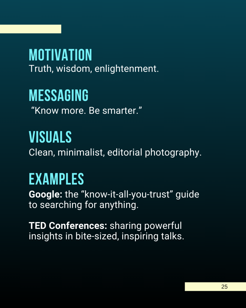
A practical guide for tech startup founders and their teams
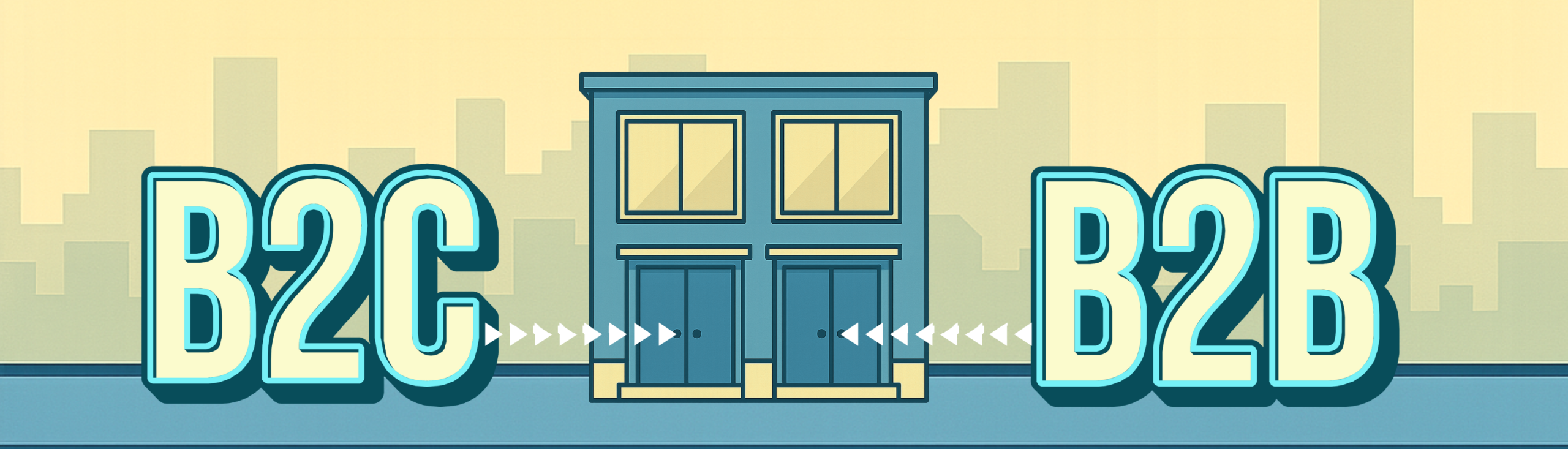
Imagine your tech/SAAS product is a townhouse with two front doors.
Through the left door (B2C) walks a creator, student or solo hustler who wants to get something done today with minimal friction. They buy with feelings first and facts later, if at all. It’s the equivalent of hitting Netflix’s “Skip Intro” button: straight to the action, no time wasted.
Through the right door (B2B) comes a small team, led by the Head of Operations, who has spreadsheets bookmarked the way most people have Spotify playlists, trailed closely by IT, Legal and the CFO. They don’t just buy, they justify to a group. Typical B2B buying groups include six to ten stakeholders, and 77% of buyers describe their last purchase as “very complex.” Your job is to reduce the headache. (Gartner)
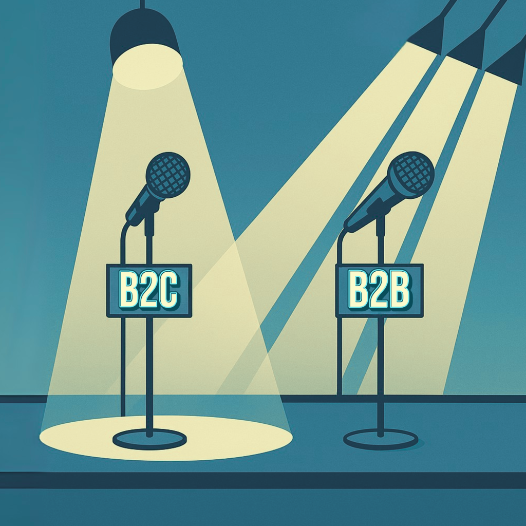
Same house, different welcome mats: The challenge is to design messaging that feels tailor-made to both audiences without splitting your identity in two.
Why the messaging must differ
The psychology, minus the lab coat:
1) Decisions happen in different contexts
- B2C customers pinball through a “messy middle” of exploration and evaluation, influenced by shortcuts like social proof, authority and the magic word “free.”
Make choices feel simple, safe and fast. (Think with Google | Decoding Decisions PDF | Google Business) - B2B buyers don’t move neatly down a funnel. They tackle “buying jobs”: define the problem, explore solutions, build requirements, select suppliers; often looping back. Complexity is the villain; clarity is your hero cape. (Gartner)
Examples:
B2C: Show a looping demo right in the hero, followed by three short testimonials. If you offer a design tool, don’t dump users into a blank page. Give them a template option upfront, like in The Matrix, where Neo first trains in a dojo program with rules, instead of being dumped into endless white space.
B2B: Structure navigation around the jobs buyers must complete. A tab called “Security & Compliance” reassures the IT director instantly, the way an Office character clutches their mug in a tense meeting.
2) Emotion matters in both, it just wears different outfits
- In B2C, emotionally connected customers are far more valuable than merely satisfied ones. Delight beats “fine.” (Harvard Business Review)
- In B2B, value extends beyond features and price. Bain’s B2B Elements of Value shows buyers weigh functional, ease-of-doing-business and personal benefits (like reduced anxiety or reputation gain). Speak to outcomes and career safety. (Harvard Business Review | Bain & Company). See this infographic by BAIN & COMPANY .
Examples:
B2C: “Make a slick video in minutes, no editing required.”
Then prove it with a before/after clip.
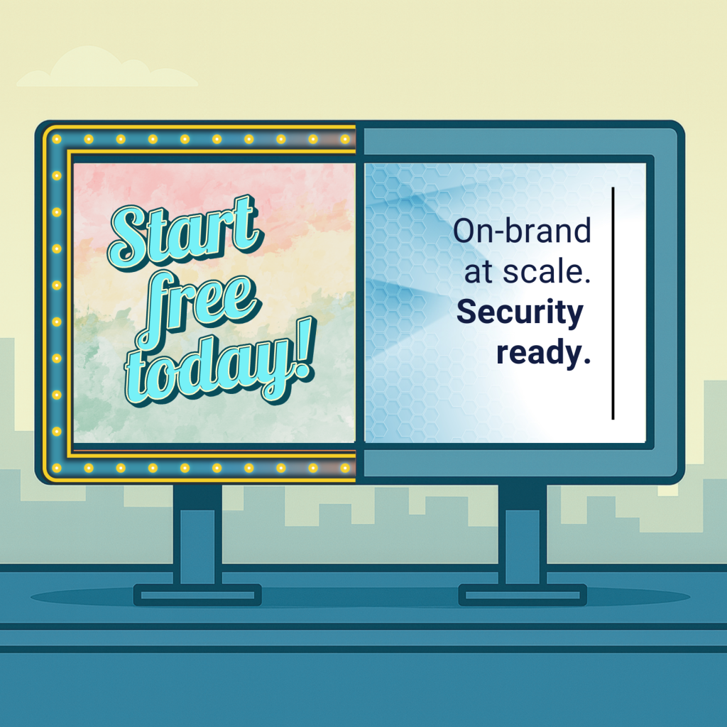
B2B: “On-brand content at scale. Brand controls, single sign-on (SSO) and audit trails.”
Follow with a stat like “Reduced rework 41% in one month.” That stat is your Jedi mind trick for the risk-averse stakeholder.
3) Big money closes online
- B2B buyers are now comfortable spending six figures remotely. In fact, one in five say they’d spend between $500k and $5m fully digitally. (McKinsey & Company)
Examples:
Dual calls-to-action (CTAs). Offer “Start free” next to “Talk to sales.” A technical champion may want to try before they evangelise; procurement wants the formal chat.
Make proof visible. “Security” and “Integrations” deserve top-nav spots, not footnotes. Think of the Star Wars opening crawl: the crucial context appears in the first frame, and your IT and Legal audience is reading it closely.
4) Friction kills conversion
Design improvements in checkout flow can deliver up to a 35 percent increase in conversion rate. That’s not a luxury, that’s survival. (Baymard Institute)
Examples:
B2C: Start with just email and password. It should feel like scanning your boarding pass at the gate, green light, through.
B2B: For security forms, split into steps with progress markers. Use plain English, not “corporate-ese.” (Nielsen Norman Group)
5) Trust is the currency
In 2025, 80% of people say they trust the brands they use. Trust comes from clarity and usefulness, not slogans. (Edelman)
Examples:
Create a Trust Centre. Even small startups can publish their stance on certifications, subprocessors and data handling. Honesty about what’s “in progress” often builds more confidence than a shiny but vague badge.
Show stability cues. Status page, uptime numbers, regular release notes.
What changes in your copy
Same product, different “why”.
Value proposition
B2C: “Create studio-quality videos in minutes. No experience required.”
B2B: “On-brand content at scale. Permissions, SSO, audit logs.”
Tone
B2C: Warm, human, vivid.
B2B: Precise, credible, risk-aware, but human.
Examples:
Dry robotic B2C: “AI-powered editor enables rapid rendering.”
Human B2C: “Edit faster than you can say lightspeed.”
Dry robotic B2B: “Enterprise content solution with robust features.”
Human B2B: “Control your brand at scale. Permissions, brand kits, audit trails.”
Proof
B2C: Ratings, UGC, demos, before/after.
B2B: ROI/TCO, case studies, security docs, integrations.
Calls to action
B2C: “Start free.”
B2B: “Start free” + “Talk to sales.”
The two-door website pattern
Individuals homepage: Hero demo → templates → social proof → CTA.
Teams/Enterprise page: Outcomes, customer logos, integrations, trust centre, ROI calculator, dual CTA.
Trust Centre: Answer IT/security questions before they ask.
One product, two journeys (without two codebases)
Pricing & packaging
Personal: 1 seat, basic export.
Team: roles/permissions, brand kit.
Enterprise: SSO/SCIM, DLP (data loss prevention), audit logs, SLAs (service level agreements).
First-mile onboarding
B2C: Start instantly from template/import, minimum fields, progress confetti (yes, it works).
B2B: Two doors: self-serve trial or calendar with sales. Auto-surface security docs when someone enters a company email.
Go-to-market motion
Gainsight’s Product-Led Growth Index shows that free trials which use Product-Qualified Leads convert at 25 percent, compared to 9 percent for free accounts without them. (Gainsight)
Microcopy you can steal (which technically makes it non-stolen)
B2C hero:
“Make a slick [asset] in minutes.”
“Start free. No [specialty title] skills required.”
B2B hero:
“On-brand content at scale.”
“Brand controls, SSO and the integrations your teams already use.”
B2C bullets:
“Pick a template, swap your content, hit publish.”
“Look pro without staring at a blank page.”
B2B bullets:
“Reduce rework 40% with brand kits and permissions.”
“Pass security: SOC 2, SSO/SCIM, audit logs, ready for IT.”
The evidence-backed checklist
- Plain language → higher comprehension, lower cognitive load.
- Reduce friction → ~35% lift.
- Design for the messy middle → proof and clear pricing.
- Let big deals close online → self-serve for $500k+.
- Prove personal relevance → trust is built on usefulness.
A 30-day plan to ship version 1
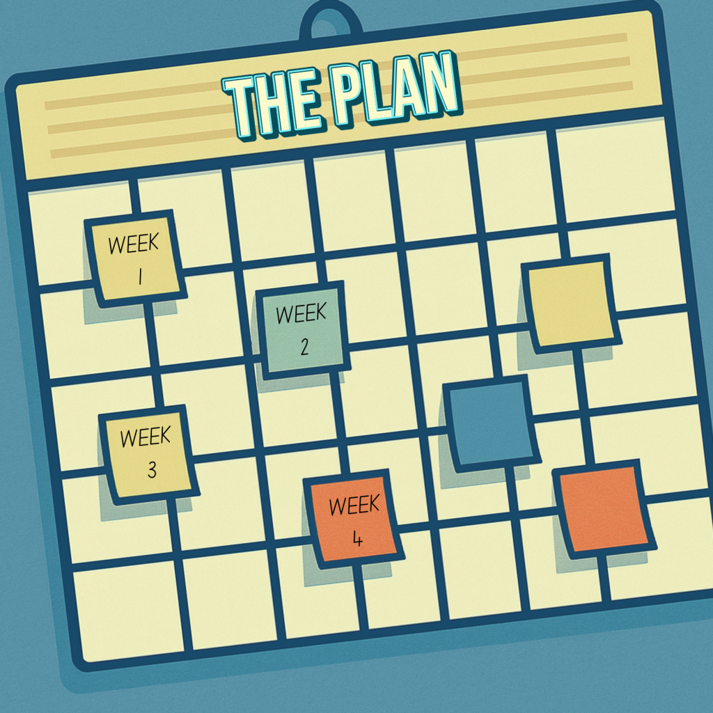
Week 1: Message architecture
– Draft a one-page Master Narrative.
– Split into B2C pillars (Create fast, Look pro, Have fun) and B2B pillars (Governance at scale, Efficiency, Security).
Week 2: Pages that unblock buying
– Publish a Teams/Enterprise page with outcomes, logos, ROI.
– Add Security & Trust and Integrations.
Week 3: First-mile & PQLs
– Capture activation moments.
– Define PQL triggers (e.g. created 2 projects + invited 2 teammates + used brand kit).
– Route to sales.
Week 4: Test & tune
– A/B test B2C copy (clever vs plain), and B2B copy (governance vs efficiency).
– Trim forms.
Handy side-by-side
| B2C (Individual) | B2B (Teams/Enterprise) | |
|---|---|---|
| Decision style | Fast, feelings → function | Slower, consensus, risk-aware |
| Top promise | “Look pro fast” | “On-brand at scale” |
| Tone | Warm, visual, plain | Precise, outcome-led, credible |
| Proof | UGC, ratings, demos | ROI/TCO, security, integrations |
| CTA | Start free | Start free + Talk to sales |
| Killer friction | Confusing UX, long forms | Missing security details |
| Design star | Reduce cognitive load | Reduce buying complexity |
Closing Thoughts
When you sell one product to two audiences, you’re not writing two novels. You’re writing two back-cover blurbs for the same book. Consumers want to feel like heroes; businesses want to look like geniuses who didn’t set fire to the risk register.
If your startup is bootstrapped, this guide will help you put your product into the world with clarity and momentum. But hire professional help as soon as possible, as it will: reduce decision fatigue, accelerate growth and lower the risk of costly missteps.
– End of article –